Twelve Twenty Coffee
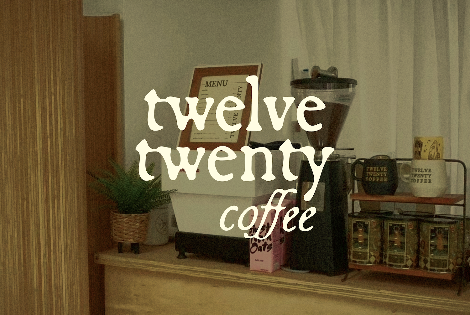
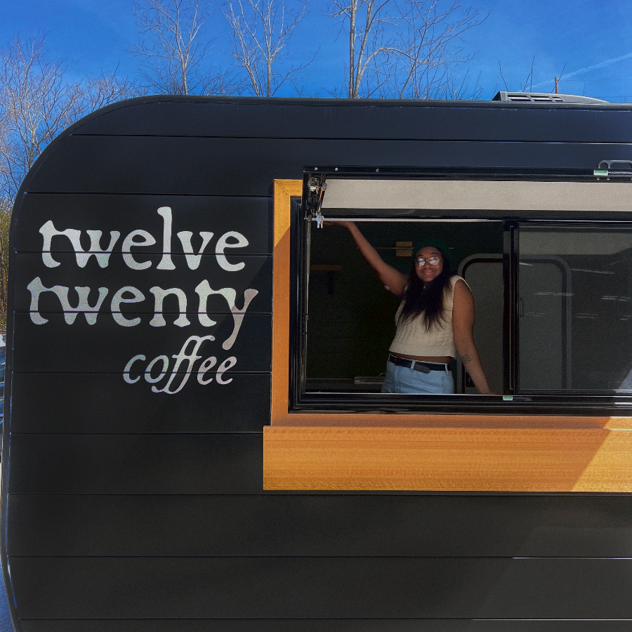
Twelve Twenty Coffee is a mobile specialty coffee shop slinging hand-crafted beverages to events, festivals, and pop-ups throughout the DMV area. Anything they don’t make themselves, they bring in from woman and BIPOC-owned local businesses, like their beans, alt milks, and sweet treats.
The Project
Brand identity, marketing and event
collateral, custom merch, illustration

This project was a brand refresh to mark the transition from a brick-and-mortar shop to a fully mobile coffee business. We worked together on their original visual identity back in 2021, and knew we wanted to retain the core brand concept. The updated brand needed to convey a sense of evolution, maturity, and adaptability to suit a constantly changing environment, but maintain the familiar imagery and vibe that locals had come to love. The goal was sleek, adaptable brand that could harmonize with a variety of locations and customer groups, but kept the inviting tone and playful themes familiar to locals,
The challenge became updating the visual system without losing the equity established with the community by the original brand. The rebrand retains the playful themes that inspired the cafe concept as an undertone, but simplifies the overall look. The original visual identity was designed for a cozy cafe atmosphere, and with the transition to a mobile trailer, the context shifted dramatically. Different settings, different customers, and different events meant they needed a look that could adapt.
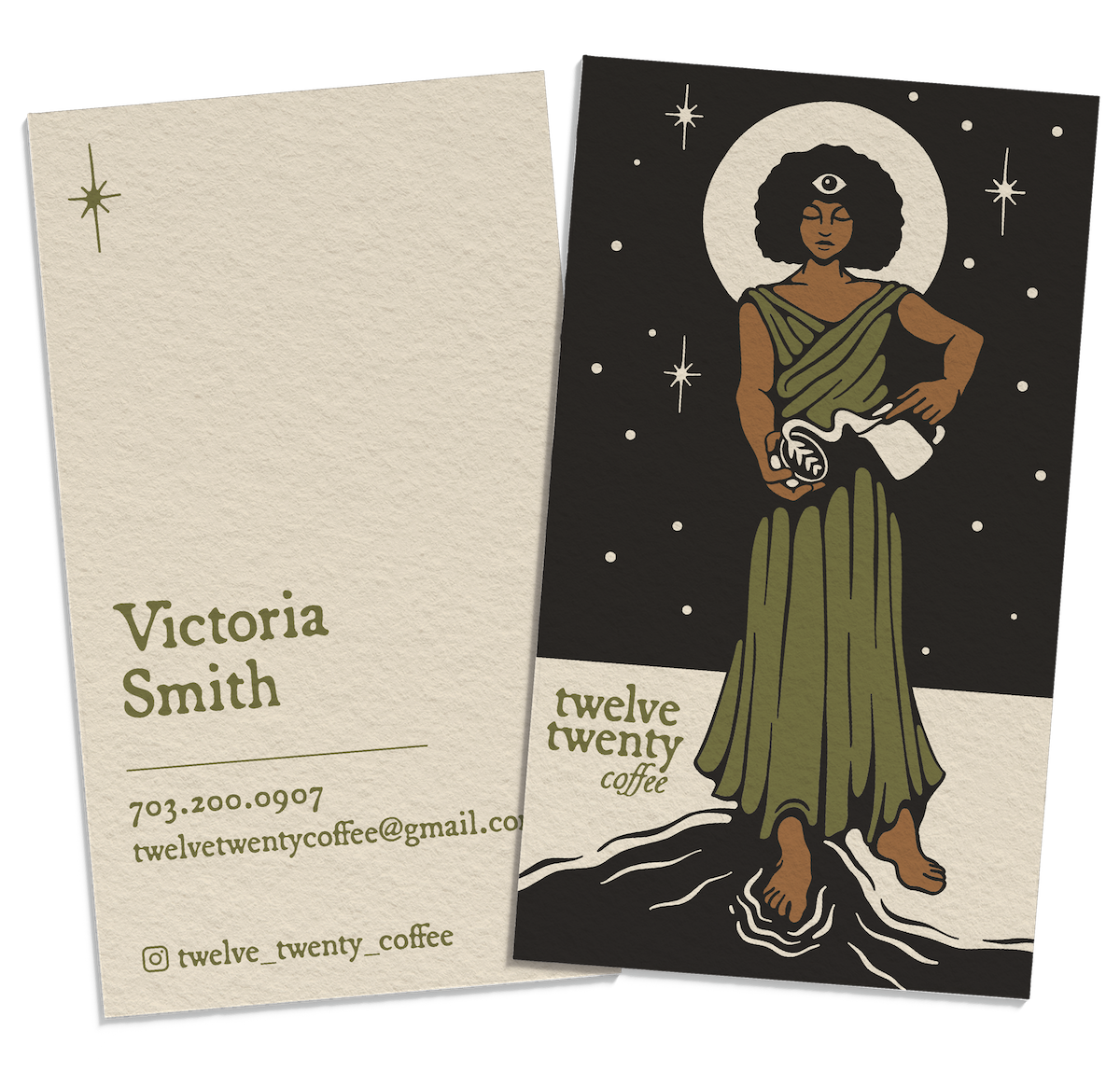
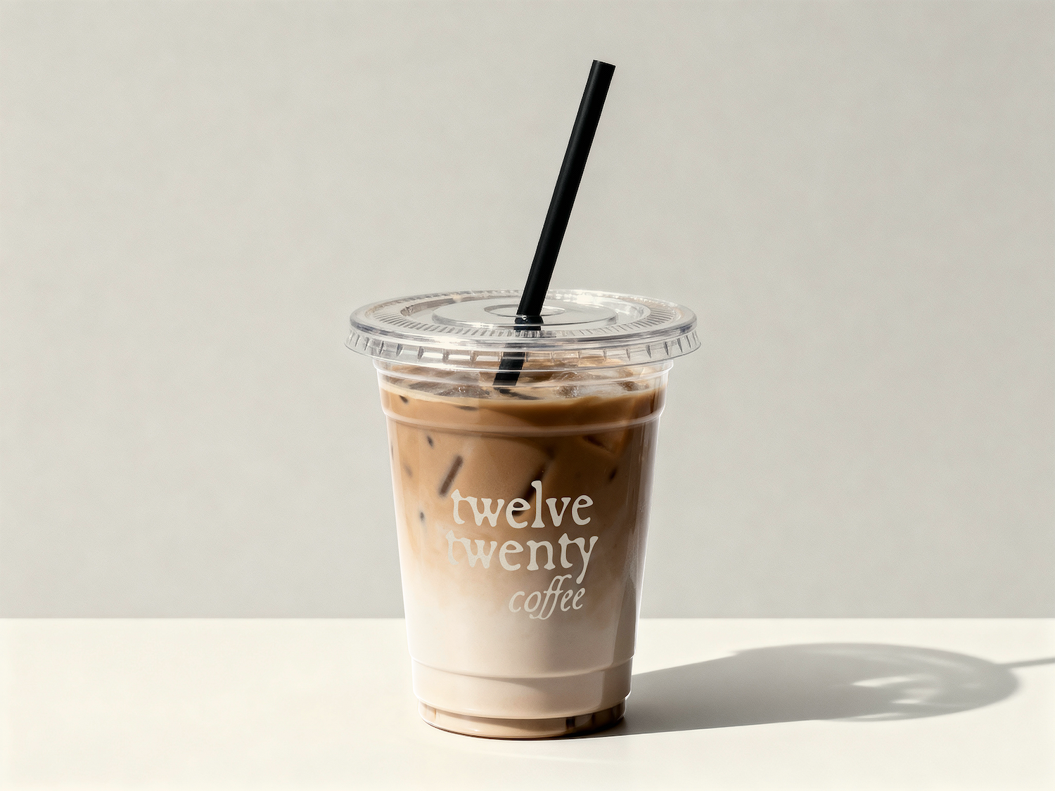
The updated branding needed to work just as well at a corporate event as it would at a wedding or a farmer’s market. We opted for fairly minimal logotype to keep it polished, but used a typeface that mimics printed newspaper type to give it a handmade feel. I reworked the main Tarot-inspired illustration, giving it a cleaner finish that was easier to translate to various applications.
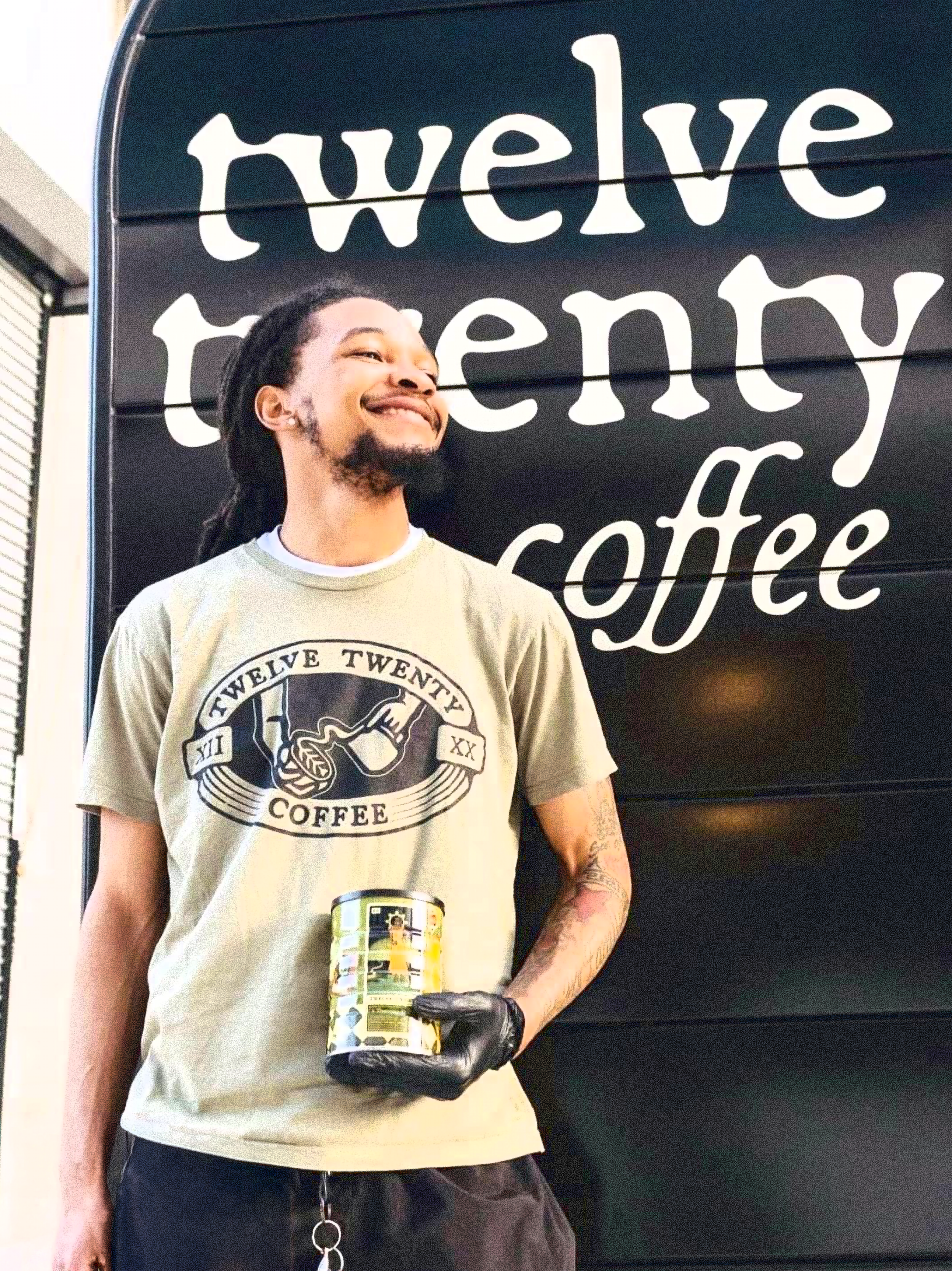
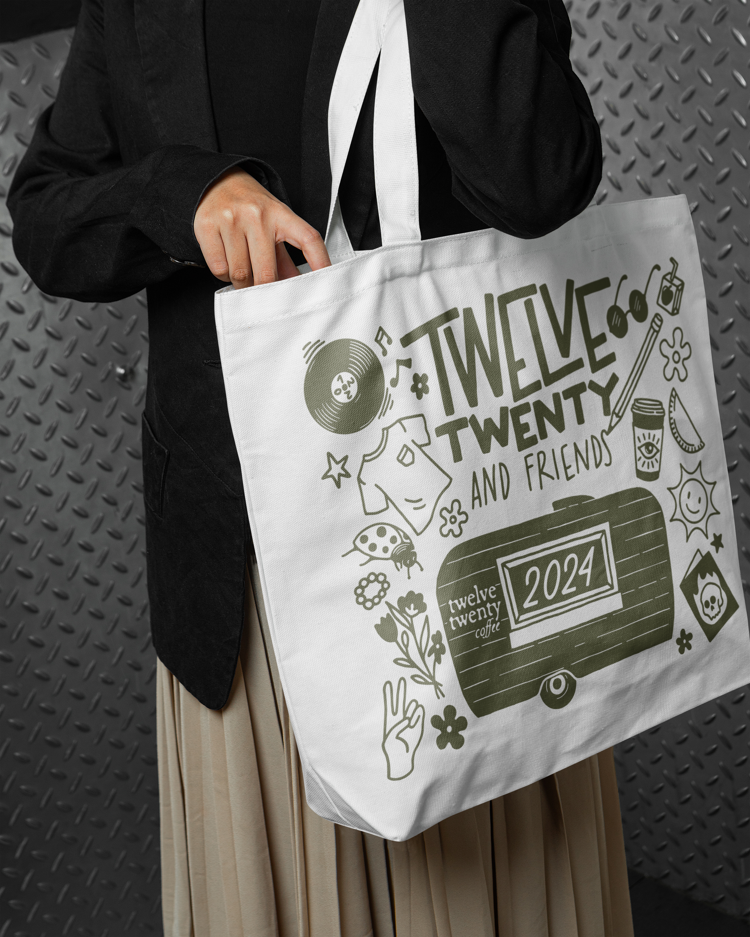
The team celebrated their relaunch with a pop-up vendor market featuring local retailers, artists, and food vendors. We debut the brand at the event with custom merch, including a limited edition illustrated coffee tin.