Poor People’s Campaign
Poor People’s Campaign (PPC) is a non-violent, direct action movement that means to “confront the interlocking evils of systemic racism, poverty, ecological devastation, militarism and the war economy, and the distorted moral narrative of religious nationalism”. Originally organized by Rev. Dr. Martin Luther King Jr. in 1968, PPC continues to rally poor and marginalized people with events and marches across the country to push for economic justice and moral revival.
THE PROJECT
Campaign collateral, illustration, poster and banner design
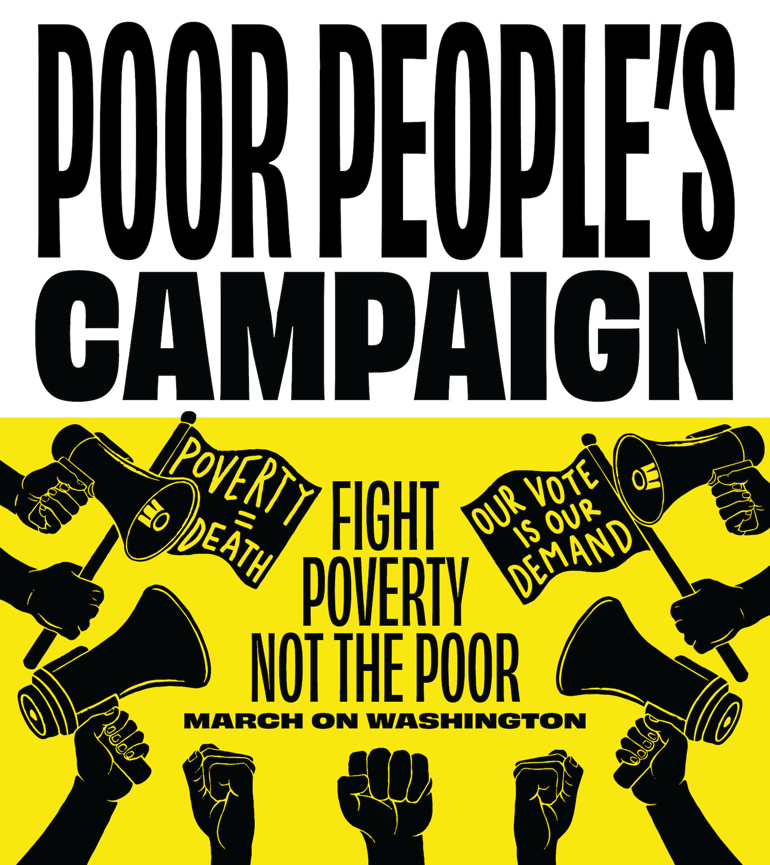
Several artists, myself included, who are involved in supporting local grassroots organizing work were asked to create artwork for the Poor People’s Campaign rally on the National Mall. Being a multi-decade organizing effort, PPC has well-established messaging and a visual identity that is well known within activist circles. The organization prioritizes evergreen messaging and artwork that can be used year to year during rallies and events across the US. This means the artwork needs to translate across a wide range of demographics, and needs to be executable by art build teams of varying size.
With a short turnaround time and extensive planning required to take action on the artwork, the PPC team coordinated with existing organizing infrastructure in the D.C. area. The organizers and artists already involved in local grassroots work were activated and tasked with the design, the art build, and distribution of the resulting posters and banners. The artwork needed to work for screen printing and hand-painting.
We worked directly with the art build team on designs that would adhere to PPC’s standard colors (black and yellow) and messaging. All the artists were asked to refresh existing messaging, and I was given the additional task of adapting artwork to newer language: “Waking the Sleeping Giant”.
Effective simplicity was key. The less colors, screens, and finicky details, the faster the turnaround.
Adaptability was the first consideration. Each illustrative element could be repurposed for various configurations to adapt to available materials and last minute changes to format. I employed a variable typeface to ensure adaptability across every format and size.
The second consideration was execution. Art builds consist of both artists and non-artist volunteers, meaning the artwork needed to be accessible for folks who weren’t artists but were asked to hand-paint assets.
Goals
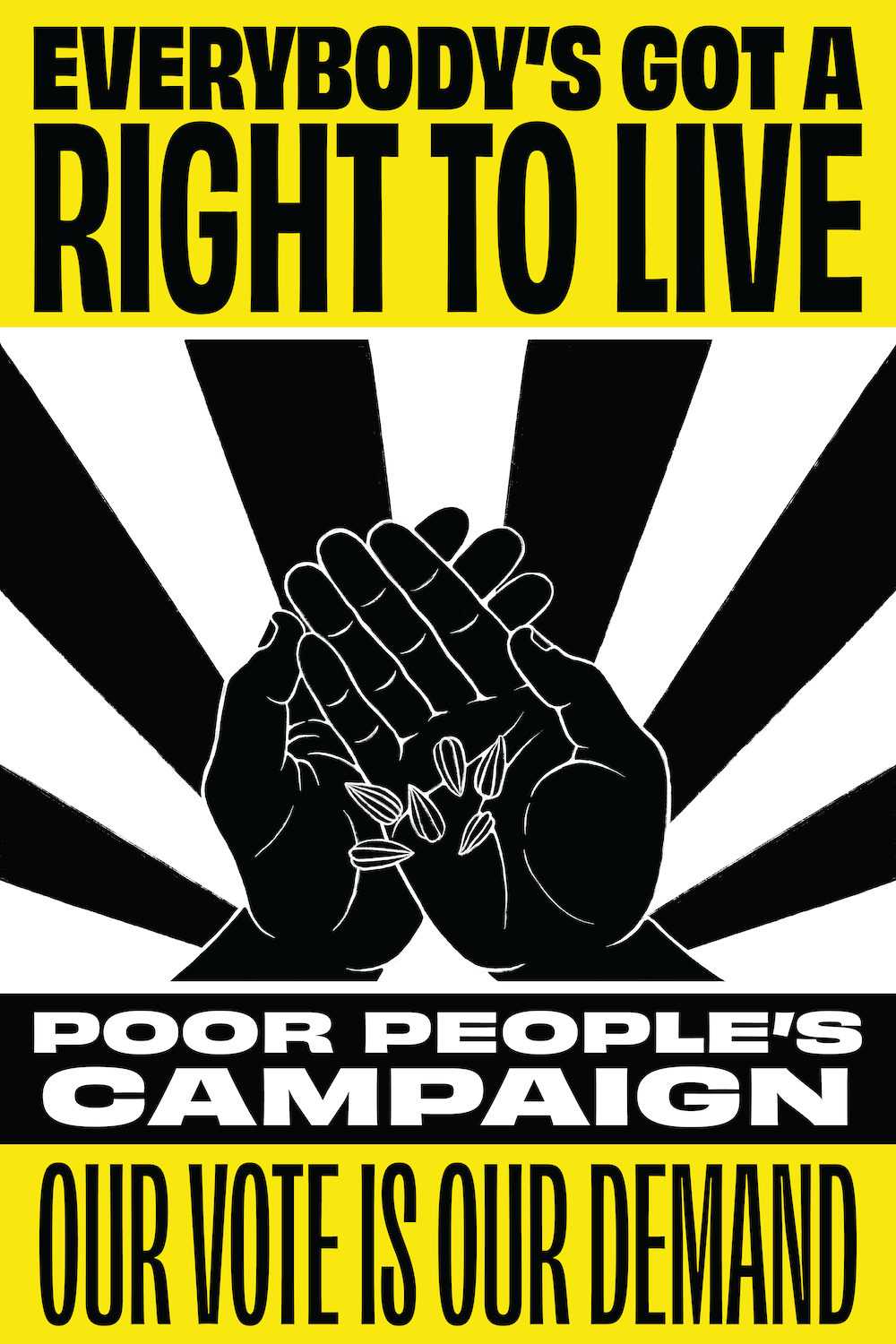
Myself and several other DMV-based artists were commissioned to create visuals for the 2024 PPC march in Washington, D.C. The graphic elements needed to work across many different formats and both large and small scale––from huge banners that took multiple people to carry, to signage small enough for a child to hold. We also had to ensure each piece was easily replicated by the art-build team, who would be hand-painting and screen printing all the artwork at a massive scale. The final results had to be modular, simple to apply, bold, and use PPC’s verbiage and guidelines for execution.


Waking the Sleeping Giant
We were given relative freedom to create within the outlined specs, and coordinate with the other artists to ensure variety. My approach was to select a slogan from PPC's campaign guidelines that resonated most vividly as an image: “Waking the Sleeping Giant”. This phrase implied a sense of scale and ferocity. Being a non-violent movement, I felt the illustration component of the Sleeping Giant needed to convey both enormity and gentleness. The small scale of the arms coming into view relative to the size of the giant’s head created a sense of scale. I mirrored this with the typography by choosing a variable typeface, which offered a huge amount of variety in weight and height to play with.
