Make Space Studio
Make Space is a non-profit seeking to transform the city of Baltimore by nurturing its creative entrepreneurs and establishing sustainable maker communities. By converting vacant property to collectively owned live-work space for creative business owners, Make Space works towards both cultivating equity and independence for creatives, as well as combatting the vacant housing crisis in Baltimore City. Through mentorships, workshops, and training programs in professional development and homeownership, Make Space helps creative entrepreneurs build community and ownership.
THE PROJECT
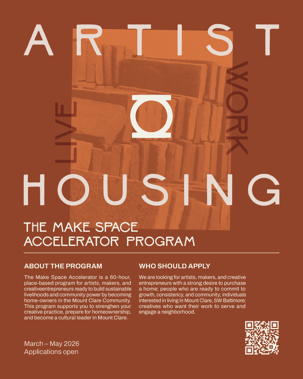
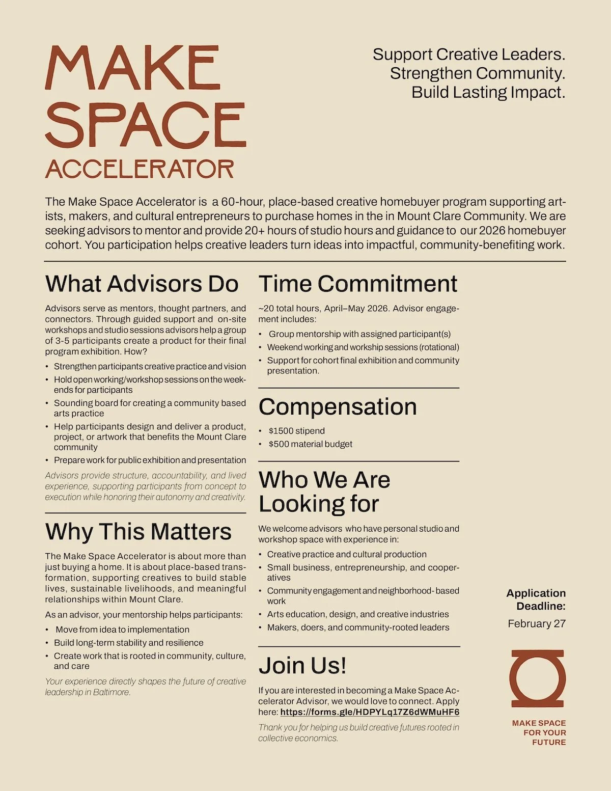
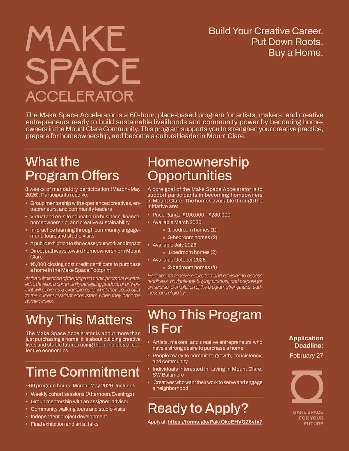
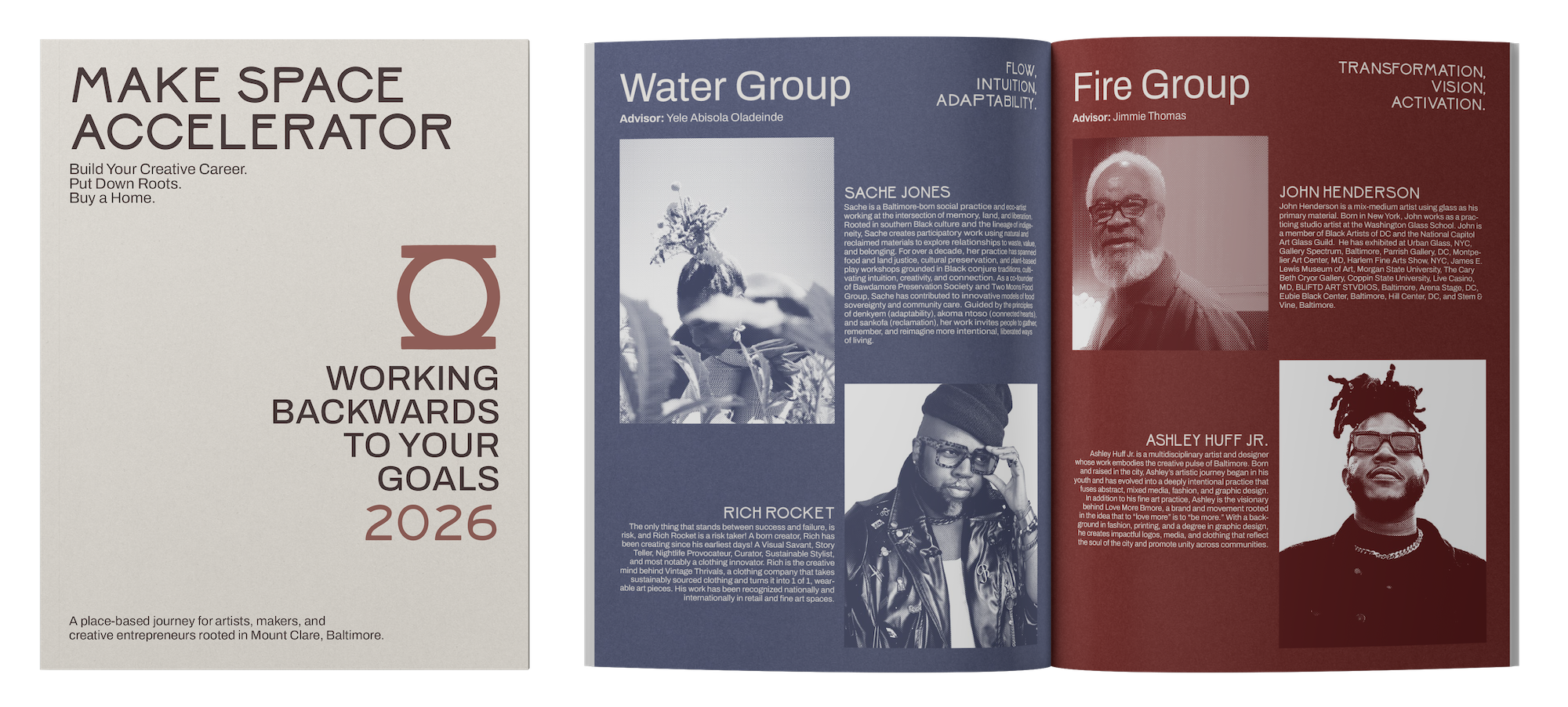
Brand identity, website, program materials, marketing collateral, layout,
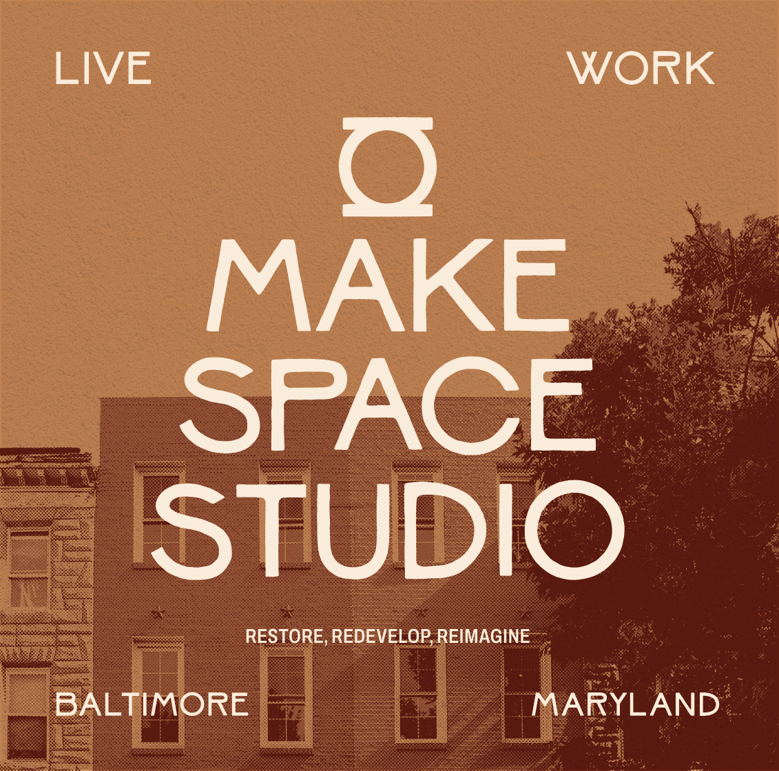
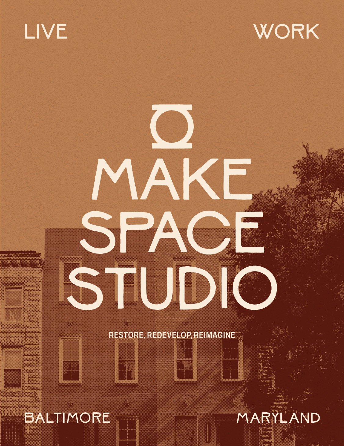
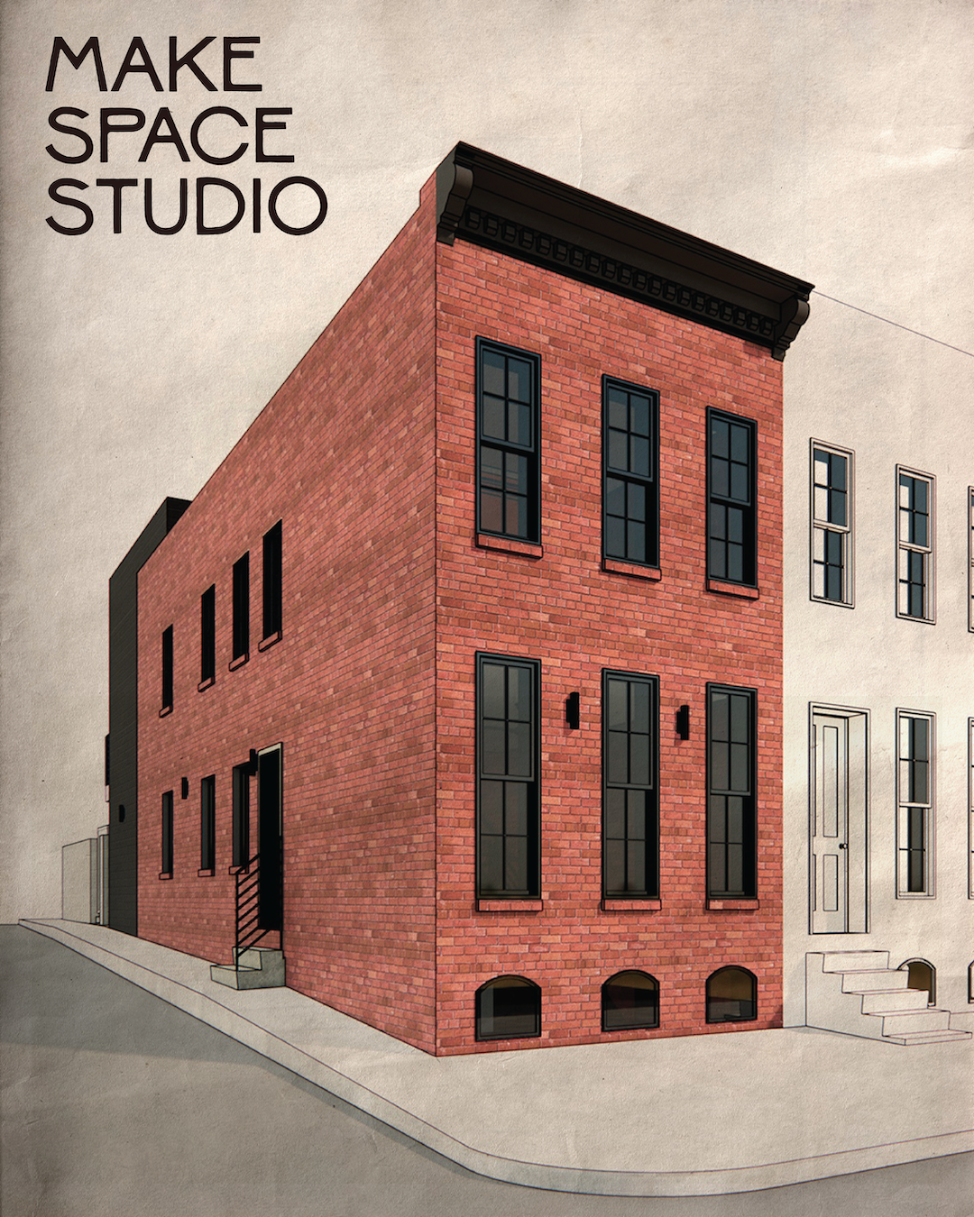
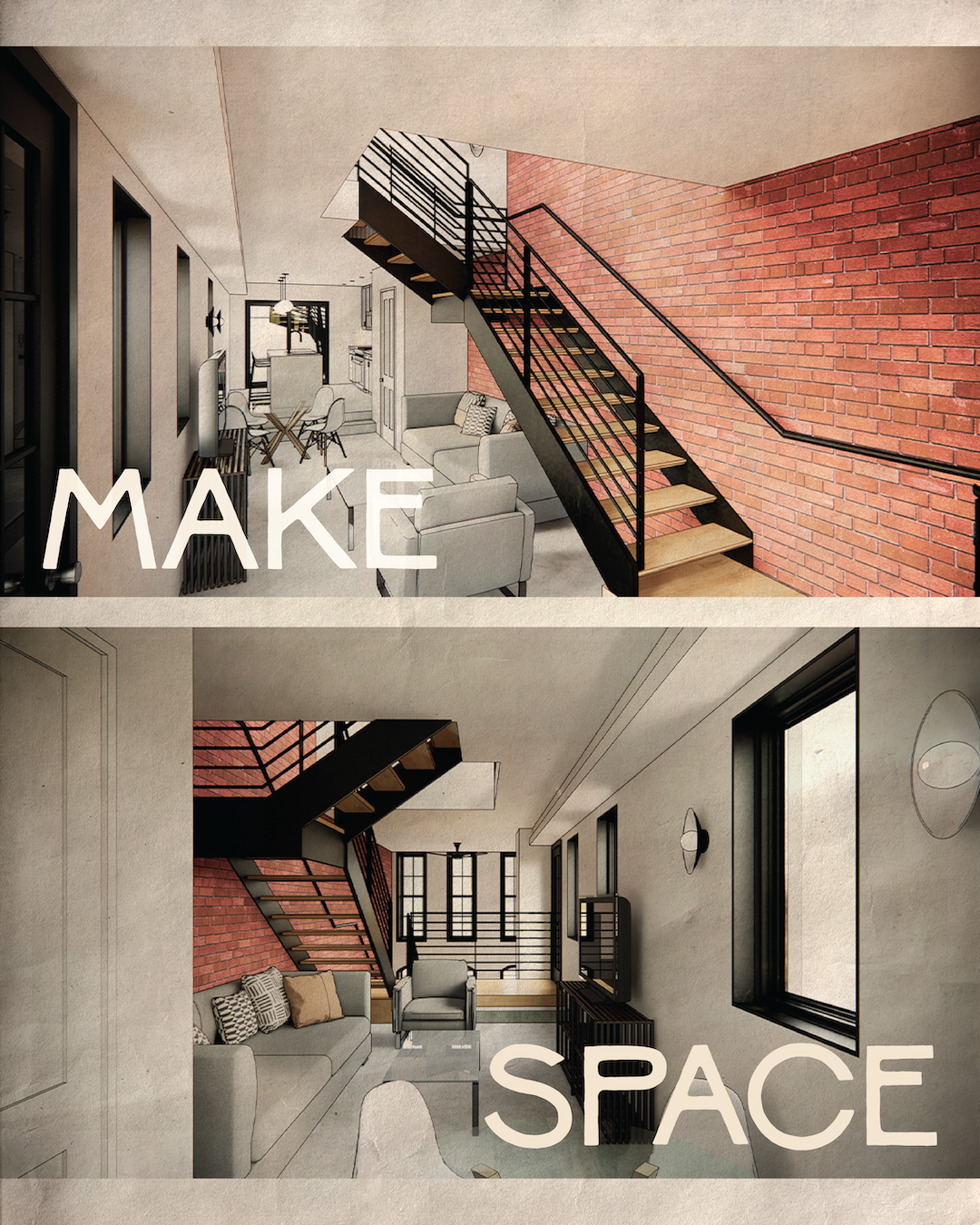
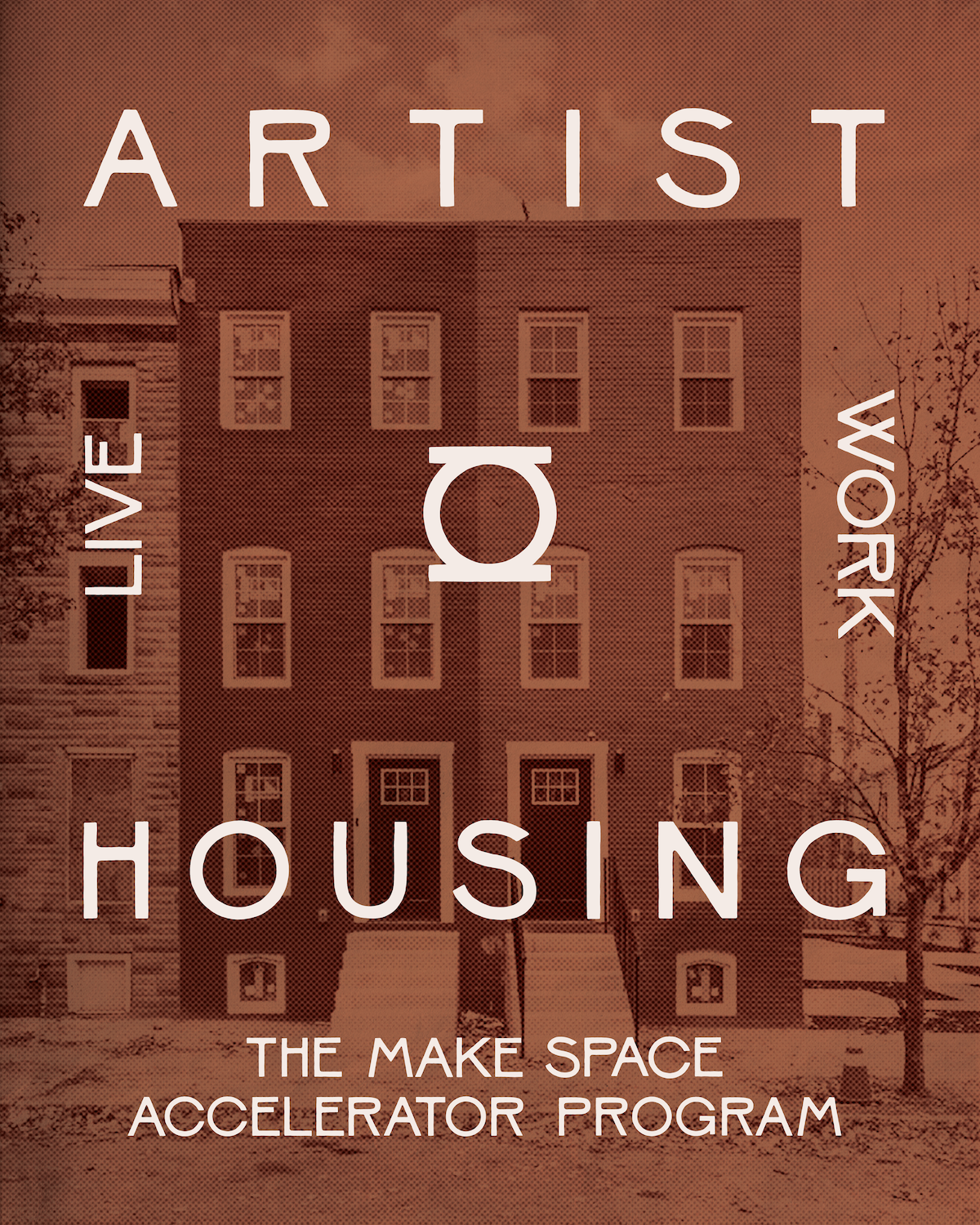
Over the last several years, Make Space Studio has been transforming abandoned townhouses into a collectively owned community for artists and creative professionals, including housing, green space, and retail space, led and occupied by creative entrepreneurs.
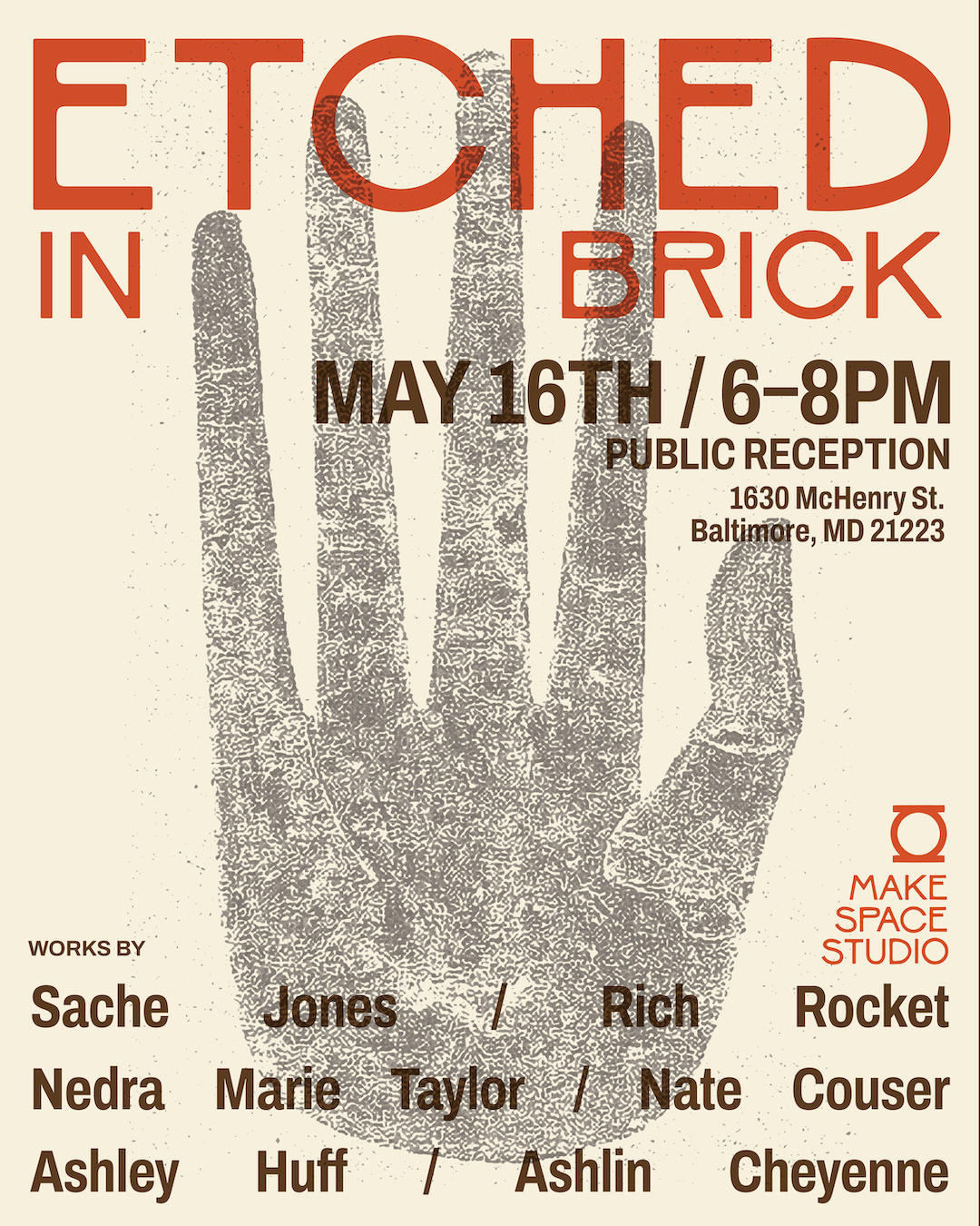
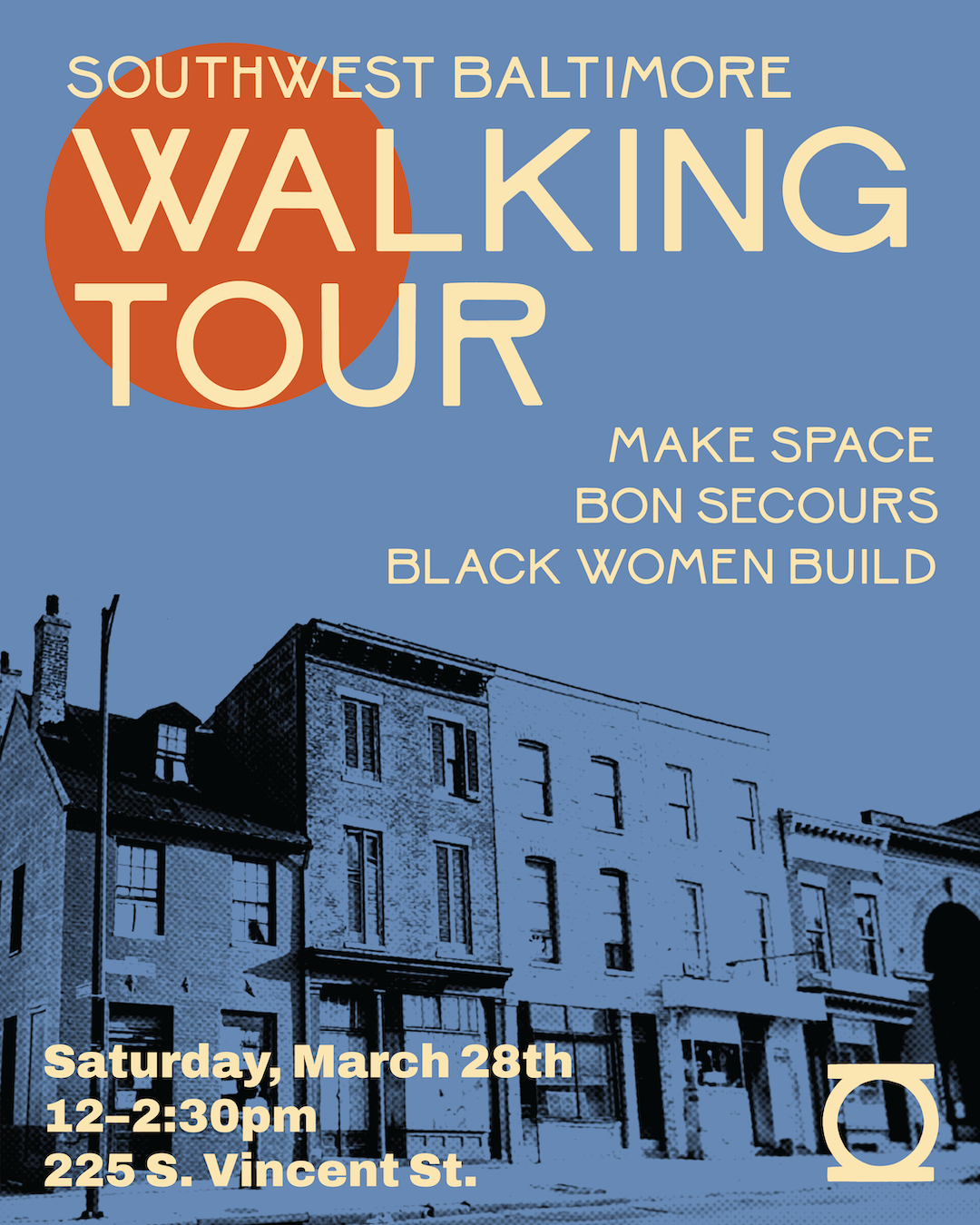
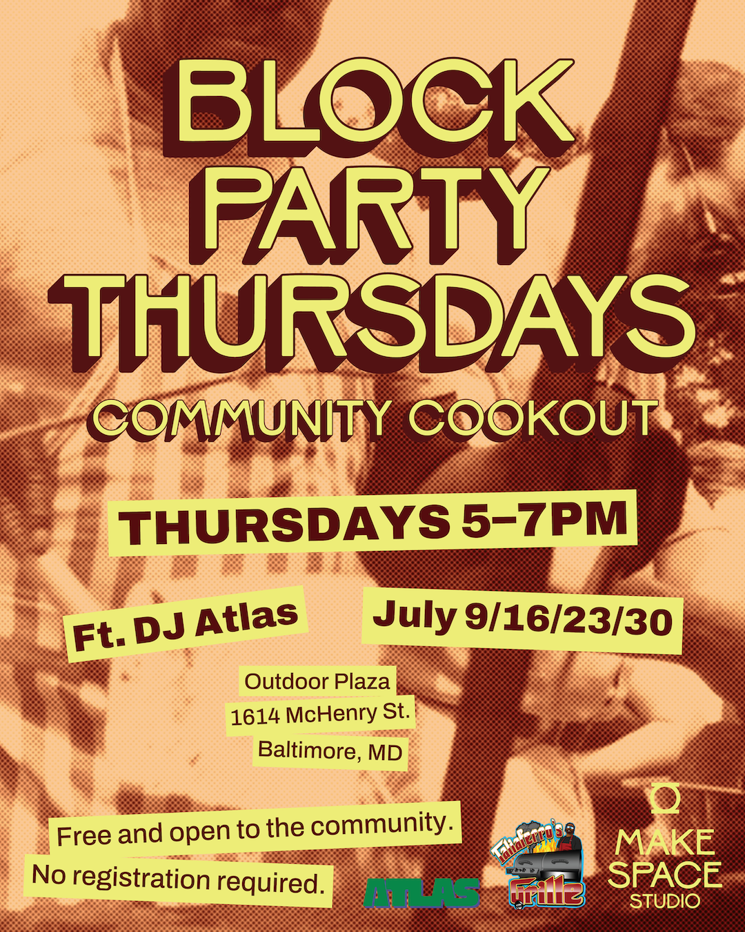
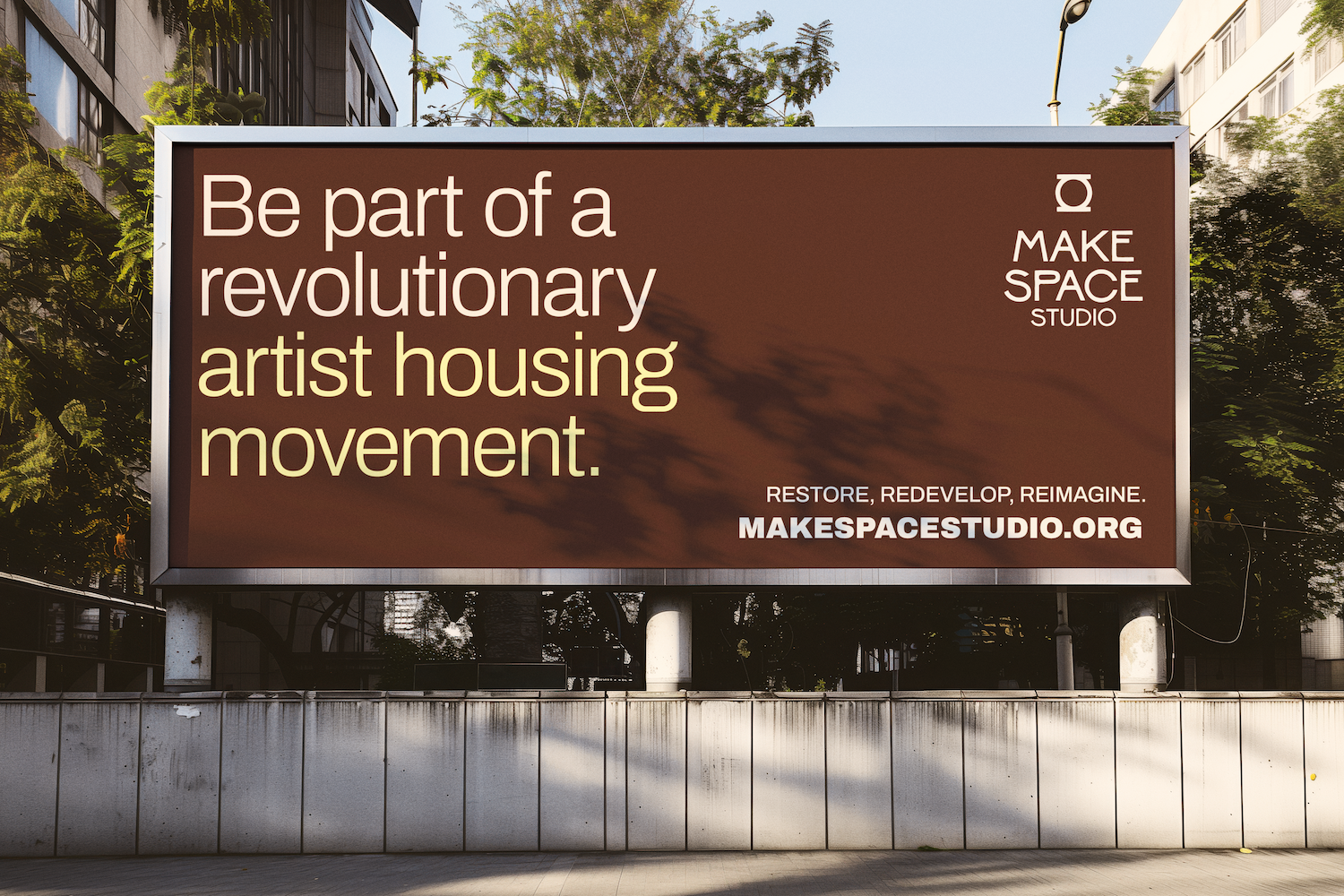
The brand needed to support a multifaceted but integrated series of projects and programming with an adaptive visual system. The visual identity needed a contemporary, artistic edge to appeal to the creative community, but feel approachable to funders and non-artist locals, city officials, and other community members.
Warmth and a homey feel were crucial to the tone of the overall initiative. Make Space needed to differentiate itself from the conventions of for-profit real estate branding and messaging and solidify itself as a people-first organization. Our challenge was to create a brand system that was artful and current, but with a grounded, historically-informed undertone that could pivot between art-focused events and content, and fundraising needs.
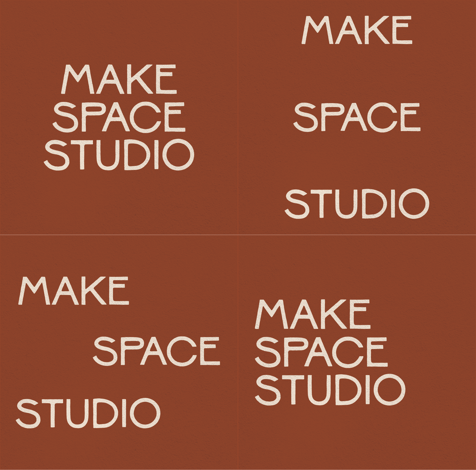
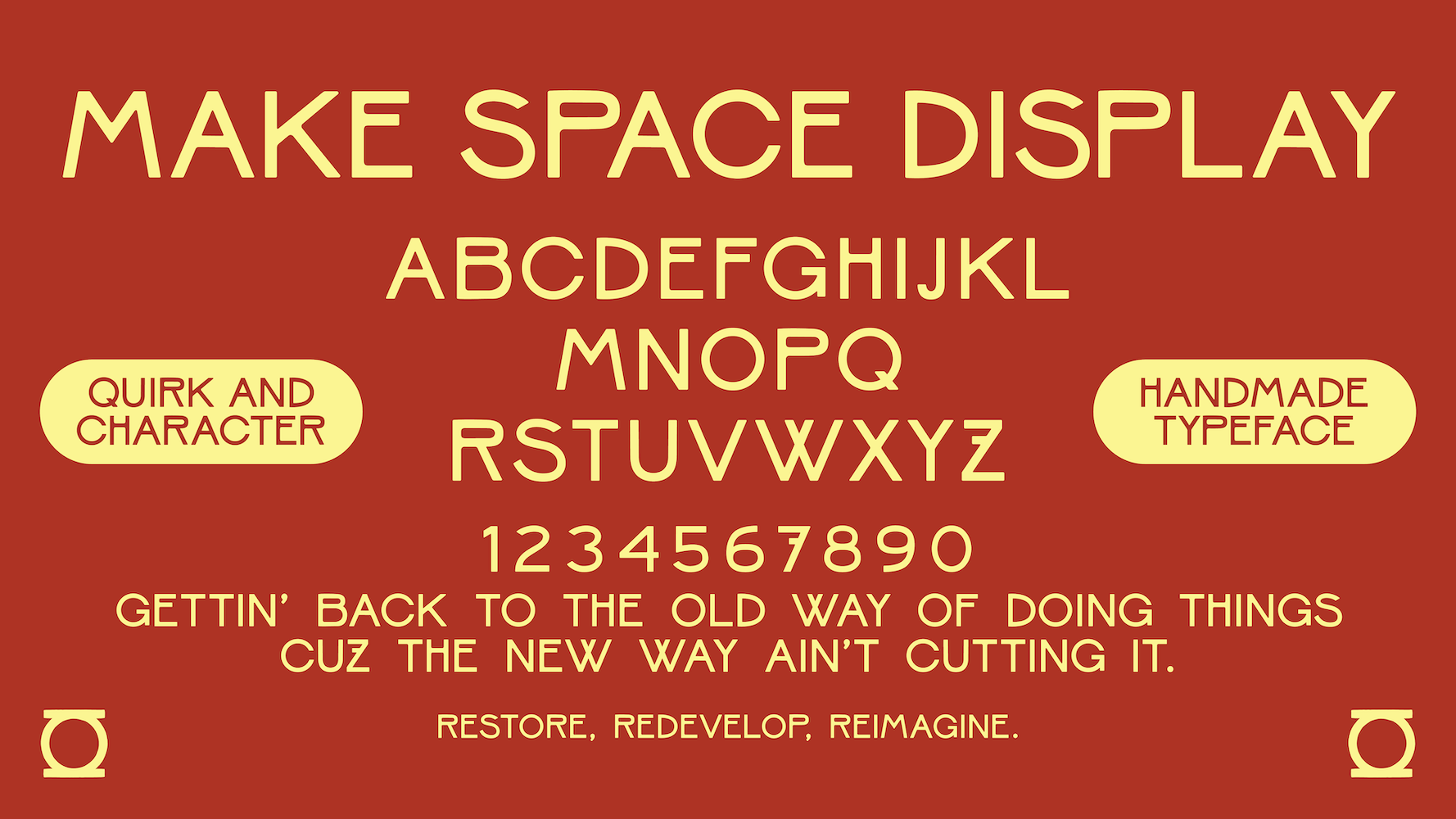
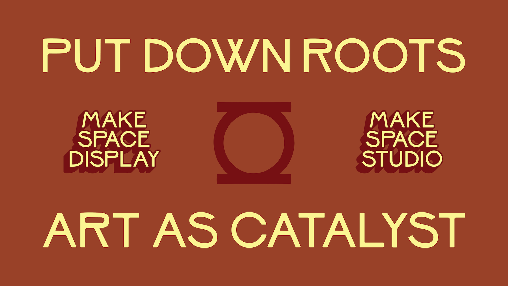
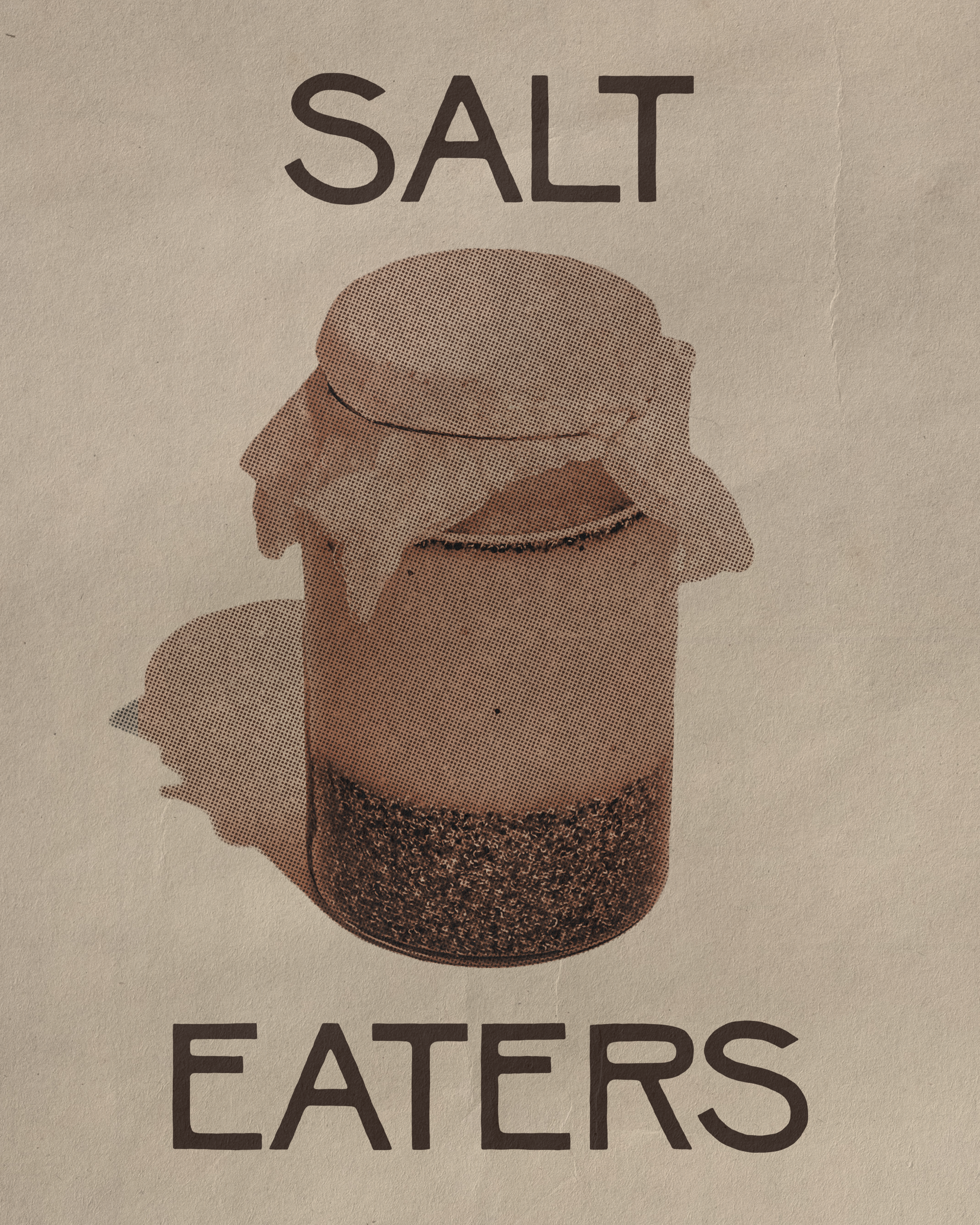
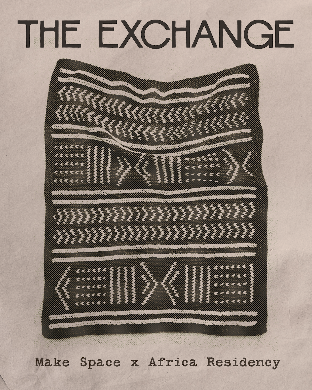
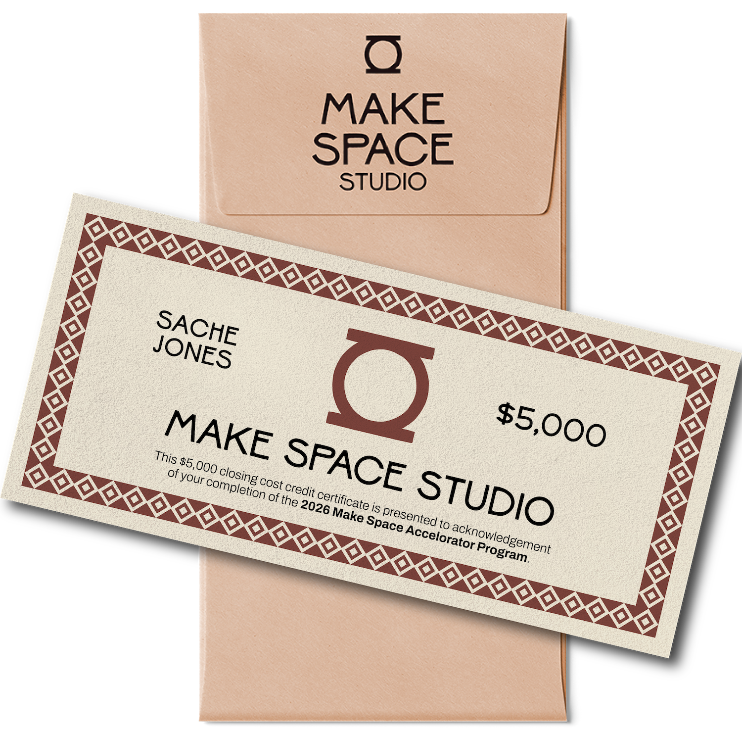
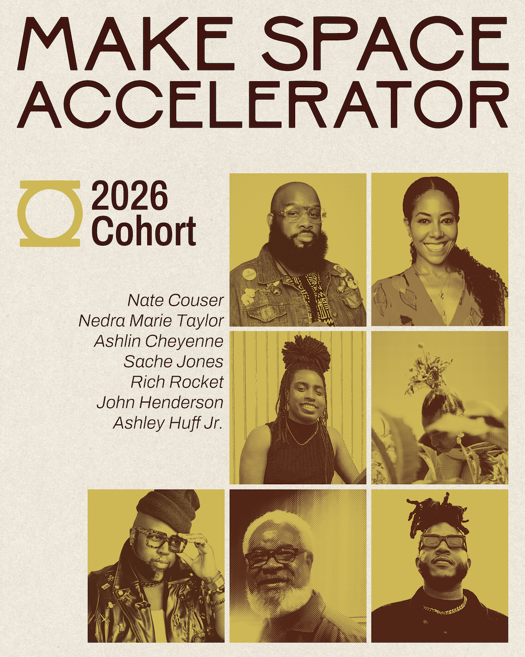
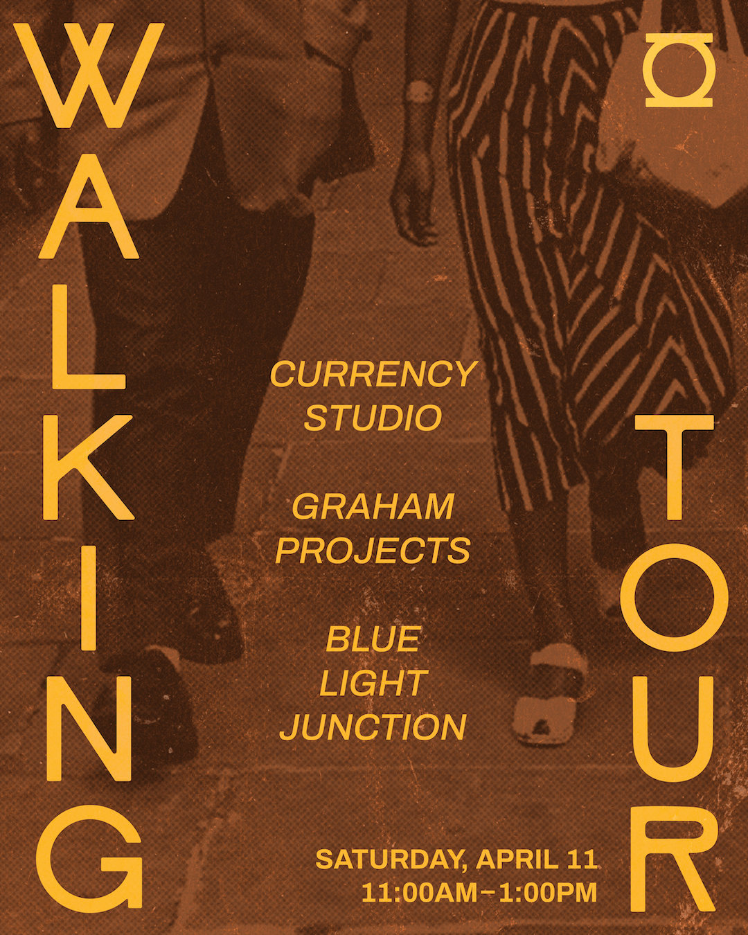
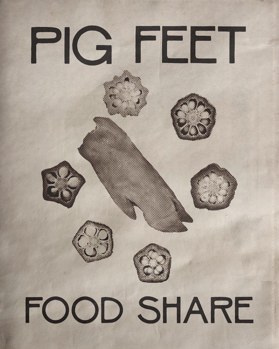
We opted for a simple but modular logo system, complete with custom logotype that eventually expanded into the brand’s own complete display typeface. Our approach to materials was to create an archival feel with lots of texture and layering, but with an underlying architectural feel. The brand elements recall the interplay of natural and built environments, with a contemporary feeling of structure, paired with organic elements and a warm color palette inspired by clay, sand, and earth.